


Tell Your Story with a Map
As a fundraiser, I want to tell my story as clearly and concisely as possible. This can be quite challenging, particularly because CDCs are diverse organizations with a number of programs addressing numerous causes in their community. One tool that I've used for years is maps, and with new data sources, the power of maps keeps growing.
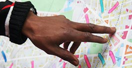
Maps help remove many of the storytelling barriers by showing complex data almost instantly. Where are the homes you’ve built located? What are the busy transportation corridors in your service area? Where are there gaps in critical services, such as poor access to supermarkets, pharmacies and job hubs? Plot this information out quickly to tell your story concisely and compellingly by sharing your successes and opportunities for future projects and programs. For a place-based organization, like a CDC, it’s a powerful tool to know how to use.
I recently attended a presentation at the Boston Foundation by Professor Sarah Williams of MIT. Her project, “Million Dollar Blocks”, is on display in New York’s MOMA. In this project, she mapped out the addresses of New York residents who are incarcerated. Those areas with phenomenally high rates of incarceration are called Million Dollar Blocks (CLICK HERE to see one of her maps). (Check out more work by Professor Williams and her colleagues) This is a map that tells a story and conveys an enormous amount of information in seconds. For civil rights advocates and professionals in Community Economic Development this isn’t necessarily revolutionary information. However, by presenting it in such a convincingly clear and concise manner, it tells a powerful story in seconds. If you’re a nonprofit looking to reduce incarceration rates, strengthen community engagement and organizing efforts, create opportunities for advancement and raise funds toward these causes, this could be a very compelling part of your presentation.
Many of us can’t afford GIS mapping tools, but take the time to learn about some of the resources that are available online for free. Google Fusion Tables are worth learning more about. You can upload a spreadsheet with data points, property listings etc. that are geo-located in minutes. The Commonwealth offers numerous data sets through their Oliver system for free. Also, MAPC has the DataCommon project. The Boston Foundation with MAPC runs the Indicators Project, which looks to be expanding some of its services for the entire state in the near future. Of course, Census.gov has resources, such as the FactFinder. Classes are offered frequently for Census resources, some of which are through the Mel King Institute, and MAPC’s DataCommon.
It only makes sense for CDCs as place-based organizations to use maps to advance how they share their projects, programs and, of course, performance to mission. With free online resources to get you started, learning how to use these tools is well worth the time commitment.